Global Health Decisions
The largest and most professional projects I have worked on by far are my visualizations for the Global Health Decisions team. I have spent at least 500 hours working on these visualizations, both as a volunteer and a paid employee.
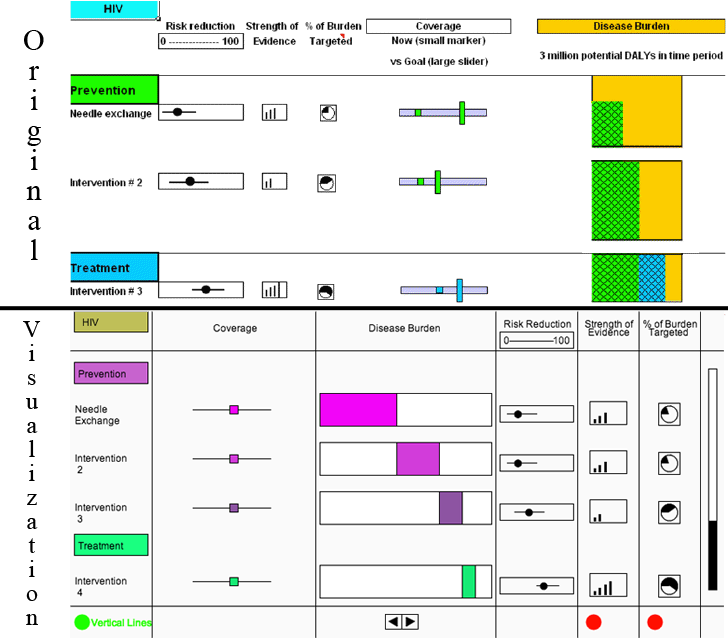
On a long flight to a WHO meeting, Dr. Jim Kahn came up with an idea for a web-based tool that would allow policy makers to view the impact of increased spending on various preventions and treatments. My first task was to create a live visualization based on Dr. Kahn's original mockup. This visualization was made using Processing.js.

Click the image use the visualization and learn more about it.
After a few months, the original design was scrapped, and I was told to come up with a few ideas for possible visualizations.
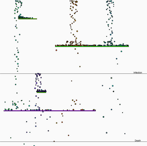
The first idea was to represent HIV infections and death as falling dots, and have platforms that would represent interventions. This visualization was also made using Processing.js.

Click the image use the visualization and learn more about it.
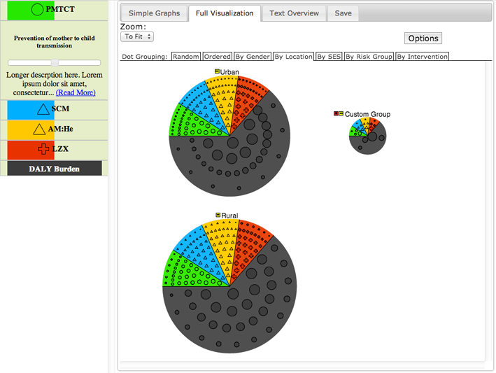
My second idea was to represent various populations using dots, and allow the user to group the dots as they saw fit. A panel of experts said that they preferred the dots, so I continued work on that over most of the summer. This visualization was also made using Processing.js.

Click the image use the visualization and learn more about it.
Eventually, it became extremely unwieldy and complicated, so it was scrapped, though the “accordion” of interventions on the side still remains in the tool today. After the dots were scrapped, the tool was split in to two parts: one was the “main” part, which displayed the data using Highcharts.js, and the other was a more specialized visualization to be created by me.
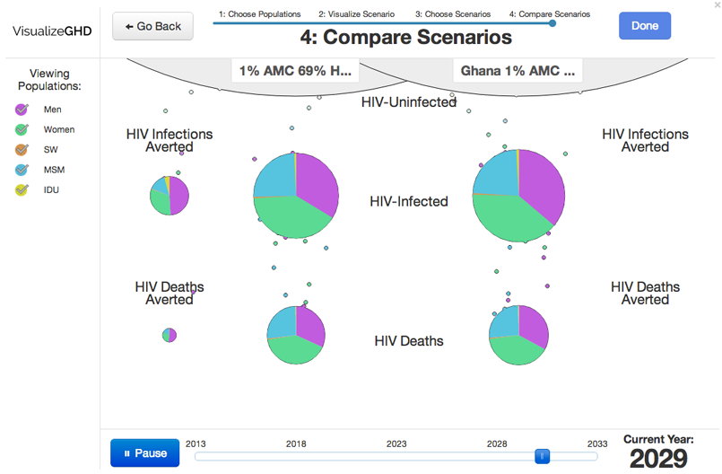
After some thought I decided it would be interesting to return to something like the flowing dots, showing the change in HIV infections and deaths over time and allowing users to compare scenarios. This visualization was made using D3.js.

You can see it in action on the Global Health Decisions website by opening the tool and clicking the “visualize" button near the upper right hand corner. However, it is probably easier to avoid all the complexity and click the image to use the visualization and learn more about it.