GHD - Original Visualization
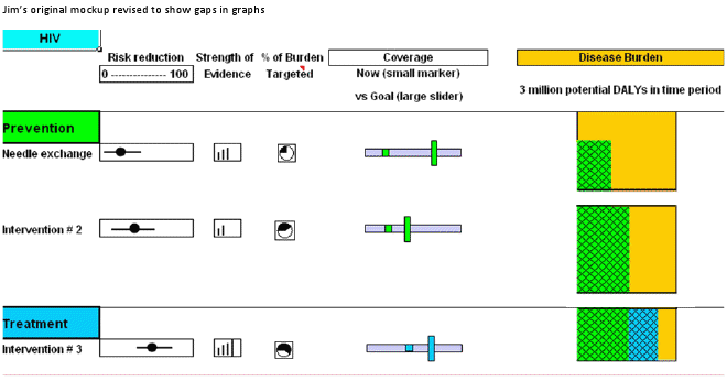
This is the first visualization I made for GHD. It is based on one of Dr. Jim Kahn's mockups (see image below) and built using Processing.js. Notes on the visualization are below the mockup

Notes

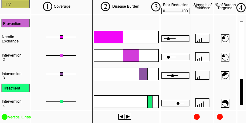
- Dragging the sliders adjusts the impact each intervention has on reducing the disease burder, though this calculation isn't based on any real data.
- This shows how much of the disease burden is averted by each intervention. The arrows at the bottom change the bars as I wasn't sure whether it would be valuable for each bar to show the impact of earlier/later interventions.
- The little icons for Risk Reduction, Strength of Evidence, and % of Burden Targeted are all dynamically generated.
- The scroll bar was probably the most difficult part of this visualization. At the time I wasn't yet thinking the visualization would have an HTML scaffold, but if I were making this again the titles, intervention names, sliders, buttons, and scroll bar would all be HTML.